Posts tagged ‘design’
The things I chose to keep to myself
– posted by russellmania3000
To the best of my knowledge, I had thought Sam was either in France or dead of bowel cancer, and for my intents and purposes, there isn’t a big distinction between either scenario. But she’s back States-side and if I know her at all she’ll be riding the I-hate-it-here wambulance for a spell, so I guess we’ll see if any further contributions from her are forthcoming. I’ve been terrible busy and working on and off on a long-form piece on Jim Henson, but this is more temporally pertinent, and if I were to go another week without writing anything, I may as well give Redikulus up for keeps.
Until earlier in March, I hadn’t gone to see anything on First Friday in several months; all too often I’m too late getting there or too disillusioned from the last time I went so I skip the galleries and go straight to the bar. This month, I avoided Old City altogether and opted for a few spots I’d never visited, which didn’t really help with the disillusionment but at least it wasn’t ass-to-ankles crowded.
First stop: Juanita & Juan’s for the launch of Megawords issue 10. In case visitors didn’t want to physically handle a zine, a copy had been unbound and the pages had been tacked to the wall, which really deprives you of the experience of paging through 112 pages of in crowd ego stroking that “reflects upon the exhibition’s thirty-one days as a physical outlet for creativity in a melange of color and black and white photographs, reproductions of storefront plans and proposals, and written reflections about the project.” In other words, a scenester scrap book, in effect a publication whose subject is itself. I’m willing to give them the benefit of the doubt that this was perhaps not their strongest issue.
Second stop: Vox Populi had a exhibition called Bivouac which included: creepy drawings of Snow White; photos of constructivist/readymade-ish sculptures; film of guy telling molestation story while molesting wad of clay; film of naked Juggernauts; film of hands paging through book. There was also a performance/installation piece called Rented Time, consisting of: balloons; giant cigarette carton spinning on wall; guy in Halloween costume making funny noises, breaking in and out of character. Also three really scrawny guys talking about their weightlifting routines in the corner. Next please.
Third stop: Tiger Strike Asteroid. No link for this place, not a huge surprise, because the name should be a dead giveaway that it was just some art students’ loft. In one room they had hung what looked to be someone’s projects from a freshman year design curriculum, over-performing homework assignments but under-performing pieces of art.
Fourth stop: Toy Factory. Again no link, but again this was just another loft apartment with a name, and in some extra space adjacent the kitchen were a couple found object sculptures and some pseudo-Giger-ish drawings with Game Boys, Transformers and a smattering of other pop culture ironies-du-jour. The antique movie camera converted into a music box was a hugely redeeming factor to an otherwise lackluster display.
I should also mention something about the ambiance of these last two places. As if going into smaller spaces doesn’t already sometimes feel like you’re intruding on a private engagement, entering these last two spots, glorified residences as they were, definitely felt like I inadvertently stumbled into the wrong room. Tiger Strike Asteroid was confined and crowded and full of chatter, the place was pretty sparse, most signs of inhabitation had been tidied away, and there were definitely, like, senior citizens there, presumably done with Vox Populi and just poking around, so that wasn’t so jarring. But Toy Factory was far more awkward in that the place was larger, emptier (of people) and had all the trappings of a very cozy, comfy home. Lived in, is the phrase. A small crowd was to one side and speaking quietly amongst themselves if at all, lounging about rather than huddling together like you do when in unfamiliar territory, and one guy was in an adjacent living room watching a skateboard video like it was Tuesday. And there was a blind dog with cataracts the size of dinner plates. It felt too personal for comfort.
Contemporary art, like much of all art, is self-indulgent to an extent, but usually it comes off as an adverb, as in “this piece self-indulgently but successfully renders so and so” or “this guy paints really well, albeit a little self-indulgently.” But this month more than any other I can remember, the work I saw seemed to embrace self-indulgence in a new and profound way, as sort of the object noun/central thesis/raison d’etre. You know violence for violence’s sake or sex for sex’s sake? Well…yeah. How exquisitely postmodern. More on this to come.
Bonus round: Khmer Art Gallery. You know how in like every kung fu movie there’s some smarmy Brit who’s stealing truckloads of Chinese artifacts and selling them to “the institute” for major ducket? This place is like that dude’s hideout, only substitute Chinese for Cambodian and smarmy Brit for portly, middle-aged hippy lady. I mean, their collection is so extensive it feels pillaged.
Bonus round 2: More recently I popped over to the PMA, because, you know, what the hell, can’t be worse than First Friday. They have an exhibition on called Cézanne and Beyond which is quite possibly worth the $24. Among others, there’s some lesser-known works by Picasso, Matisse, Jasper Johns, Max Beckmann, Giacometti, Gorky, Braque and Mondrian, all of which I thoroughly enjoyed. There was also some Japanese photography and a small Gehry exhibition, which is neat if you’re into Gehry.
Nifty Fifty Shmifties

everybody must parade!
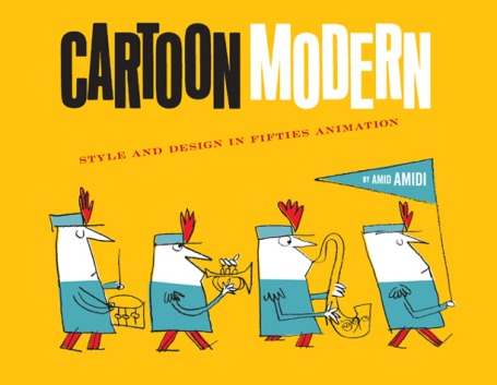
I haven’t done a design or illustration post in a while, and I need to redeem myself as an illustrator. While paging through an old Print magazine, I came across a book review for Cartoon Modern: Style and Design in Fifties Animation. I could only see the cover, pictured above, but I knew that this book was for me, and I will soon be in ownership of it! The author, Amid Amidi has also put together a very nice blog, which I have now added to my ever extending list of bookmarks. This is a great supplement to those fans of the wonderful retro blog, GrainEdit, who wish they would update more. They definitely believe in quality over quantity, and I’m not complaining.

the hardest way to play!
I’ve mentioned being into fun drawings before, whimsical characters and drawings. I have not mentioned Jim Flora, who’s work is pictured. He was a really great designer from the fifties. Now I also translate this appreciation to 50s animation as well. Fifties animation had a great style, that also featured off set inking. (Note for non-artists: off -set is when the ink color and the line don’t match up, aka off-registration printing) It also features really great textures and color themes and mixtures that are really unexpected. I wasn’t able to figure out why I was so drawn to this style until about a month ago when I saw a Mr. Magoo cartoon for the first time in several years.

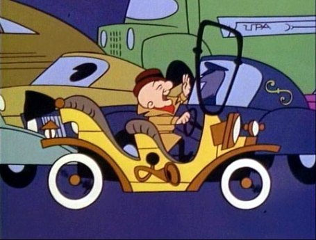
caution: blind man with a temper stuck in traffic
When I was younger, I really had a thing for old men, Mr. Rogers and Jim Henson included. The cartoon old man Mr. Magoo is really great, and I know why I liked it so much. He’s such a strong willed little man for being blind, and he always knows what he’s talking about. I think I developed a great deal of my personality from watching Mr. Magoo navigate his way around the world. He’s very sassy, which I think I’m pretty sassy. He also inadvertently becomes the center of a catastrophe frequently. Plus he acts like he’s drunk the majority of the time, becoming increasingly demanding and condescending of other characters. The cartoon is a visual feast of stuff I’m about to rip off! Netflix will be delivering a DVD to me shortly.

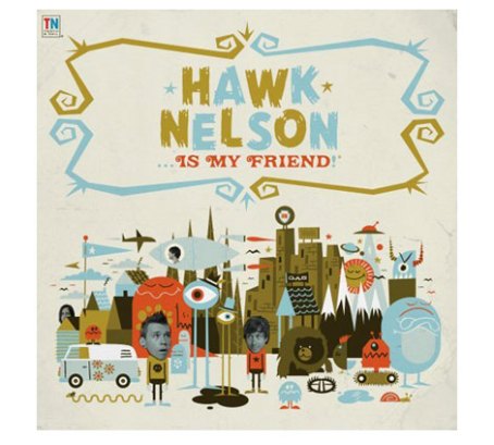
I think I would like to live here
This brings me to a studio who is cleaning up with their monopoly of this style. Invisible Creature is two guys, brothers, sitting around and drawing, having a grand old time. At least that’s what I imagine, but I know they must be working very hard to be producing the amount of work that they do. I mentioned Grain Edit earlier, and they were great enough to have featured Invisible Creature in one of their artist interviews. These interviews are really great because they usually feature some tips from the artist on how to create these visuals yourself. How wonderful is that? Wonderfully nice! I’m not so nice, I probably wouldn’t reveal my secrets.

Don & Ryan Clark of Invisible Creature
WOW! Doesn’t this all look like so much fun. Well, it’s the weekend, go off and have yourself some!
-posted by samsquared
Got the look

Russ and I went to First Friday a few months ago, in order to see the Todd St. John show. He is the brains behind HunterGatherer. I really loved his work, and was even happier to have a design show to see in Philadelphia. Although, a friend left the show unimpressed by his work.
I recently discovered that I tend to notice trends, either that or I’m OCD and find mundane connections between unrelated topics. Other people, like my friend, blaze their own trail and make trends. Maybe it’s my eye for pop culture. I’ve noticed what looked cool to me since I was 13 and started listening to the Smashing Pumpkins. I even owned a pair of silver pants. That said, I’m an illustrator who hasn’t quite found her style, but loves to draw and create, I pay extra attention to what I like when I see it.

I’ve liked Charley Harper for a few years. A classmate recommended looking at his work, as well as that of the local Eleanor Grosch. It was helpful because they love birds and I was illustrating The Nightingale and the Rose by Oscar Wilde. (I highly recommend it for you pessimists out there) I loved what I saw from these two, and Eleanor states she draws inspiration from Harper. I recently noticed how this style is everywhere now. The style of simplistic shapes and retro fitted colors seems to be on everything. Todd Oldham (who is already the cat’s meow) has put together the first complete retrospective of Harper’s work. Another big book I truly can’t afford but would love to own. Even if this is on it’s way to jumping the shark, I’m going to argue for it.
This “minimal-realism” style is getting good looks from everyone. And has been for a few years now. Yet those who are on the brink of the next wave are those who are stepping further away from the computer. Whether it’s the addition of textured brushes in Illustrator, or just scanning in a penciled drawing for an illustrator line. Hand-done quality is going to grow in popularity. As the computer grows, and the increased belief that anyone can use Photoshop, appreciation for quality hand skills will inevitably be produced. I really like where awesome people like Mike Perry and Damien Correll are taking this boat. Mike Perry also made some cool books, slightly more affordable than the Harper book.
A teacher of mine once told me that it was important to do what your happy with. He lived through the trend of 1980s and 90s airbrush. He refused to trade in his ink pen for the airbrush to get work. It’s now becoming retro and almost vintage, but for now, it’s still ugly. Harper is a retro classic, and we’ll see what outlasts the next wave.
-posted by samsquared